Bar Graph PTE often emerges as one of the trickiest question types in the PTE Speaking section, leaving many test-takers seeking strategies to tackle it effectively. As the PTE exam continues to gain global acceptance, you must sincerely prepare for every task. Bar Graph task demands special attention and a strategic mindset, even if you are practicing it on a free PTE mock test.
This blog will uncover tips, techniques, and sample answers to help you confidently decode describing Bar Graph. Read and learn tips to score high in bar graph PTE describe image question types.
PTE Bar Graph Template:
Introduction (2-4 Seconds)
- Begin by giving a brief overview of the graph.
Main Body (15-20 Seconds)
- Identify Key Variables, e.g., categories, time periods, values
- Discuss Overall Trends: Explain what is happening in the graph.
- Focus on Specific Details: Provide key comparisons or changes (if applicable).
Conclusion:
- Summarize the overall insight or trend
Start your free PTE mock test with Gurully and get AI-powered analysis for a personalized journey.

- Kickstart your PTE prep with a free AI-scored mock test
- Boost your score with in-depth analysis & smart recommendations
Tip To Score High In Bar Graph PTE
Structure Your Bar Graph Explanation:
A structured response is your best friend in the bar graph task. Here’s how you can organize your response effectively:
Introduction
- Start by summarizing what the graph represents. This provides context and ensures you introduce your answer clearly.
- Example: “The bar graph illustrates the population growth in five cities over a decade from 2010 to 2020.”
Body
- Highlight the most significant aspects of the graph. Focus on trends, comparisons, and outliers.
- Mention the highest and lowest values: “City A had the highest population of 1 million, while City E had the lowest at 200,000.”
- Discuss noticeable trends: “City B experienced steady growth, whereas City C saw a sharp decline.”
Conclusion
- Wrap up with a summary of the key trends or insights.
- Example: “Overall, the graph shows a significant increase in urban populations across most cities, except City C.”
Keep Note Of Important Things:
To ensure a high score, adopt these proven strategies and can also apply them in mock PTE test online:
Focus on Key Points
You don’t need to describe every detail. Examiners are looking for your ability to analyze data, not recite it. Prioritize:
- The highest and lowest values.
- Any unusual or unexpected trends.
- Significant changes over time.
Use Linking Words and Phrases
Linking words improves coherence and makes your response easier to follow. Examples include:
- To compare: “Similarly,” “In contrast,” “Compared to.”
- To highlight trends: “There was a sharp increase,” “This was followed by a gradual decline.”
- To summarize: “Overall,” “In conclusion,” “To sum up.
Stay Within Time Frame
- Speak for 35–40 seconds. This ensures your response is concise and focused. Exceeding the time limit might result in penalties while finishing too early can make your response seem incomplete.
Build Vocabulary:
Your vocabulary plays a crucial role in describing data effectively. Use precise words to convey trends and comparisons.
Words for Trends
- Rising Trends: Increased, rose, grew, climbed, peaked.
- Falling Trends: Decreased, dropped, declined, fell, plummeted.
- Stable Trends: Remained constant, stabilized, leveled off, stayed the same.
Words for Comparisons
- Higher than, lower than, twice as much, threefold, equal to.
Descriptive Words
- Significant, sharp, steady, gradual, noticeable, negligible.
Example: “The population of City A surged dramatically from 500,000 to 1 million, whereas City B experienced a steady rise of 20%.”
Focus on Fluency and Pronunciation:
Speak at a Moderate Pace
- Speaking too fast may cause pronunciation errors, while speaking too slowly can affect fluency. Aim for a steady, natural rhythm.
Practice Difficult Words
Graphs often include technical or unfamiliar terms. Practice these beforehand to avoid stumbles. For example:
- Words like fluctuations, significantly, and categories.
Record and Review Your Speech
Recording yourself helps you identify areas where you can improve, such as filler words, pauses, or unclear pronunciation.
Avoid Common Pitfalls:
Overloading Details
- Trying to cover every detail in the graph can overwhelm your response. Stick to the most important trends.
Hesitations and Pauses
- Fluency is critical. Avoid long pauses or filler words like “um,” “uh,” “you know.”
Ignoring Trends and Patterns
- Your goal is to analyze, not just describe. Always highlight relationships, patterns, and overall trends in the data.
- Practice For Bar Graph PTE Question Separately
Use Authentic Practice Materials
Gurully offers realistic PTE describe image questions to help you prepare. Access bar graph samples that mirror the actual exam format.
Time Your Responses
- Simulate exam conditions by timing your preparation and speaking time. Practice delivering concise yet comprehensive answers within 40 seconds.
Seek Feedback
- Have a tutor or a peer evaluate your responses. When you will practice on Gurully’s question-wise practice, you will get feedback on what is wrong and what you need to improve.
Bonus Tips for the Bar Graph Task
- Stay Calm: Nervousness can lead to rushed or unclear speech. Take a deep breath and focus.
- Use Your Preparation Time Wisely: In the 25 seconds given, note key trends and form a mental outline of your response.
- Avoid Reading Numbers Excessively: Instead of saying, “The value was 10,000 in January, 20,000 in February, and 30,000 in March,” summarize: “There was a consistent rise from January to March.
Predictive Questions of Describe Image – Bar Graph PTE With Answers
Example – 1
Description:
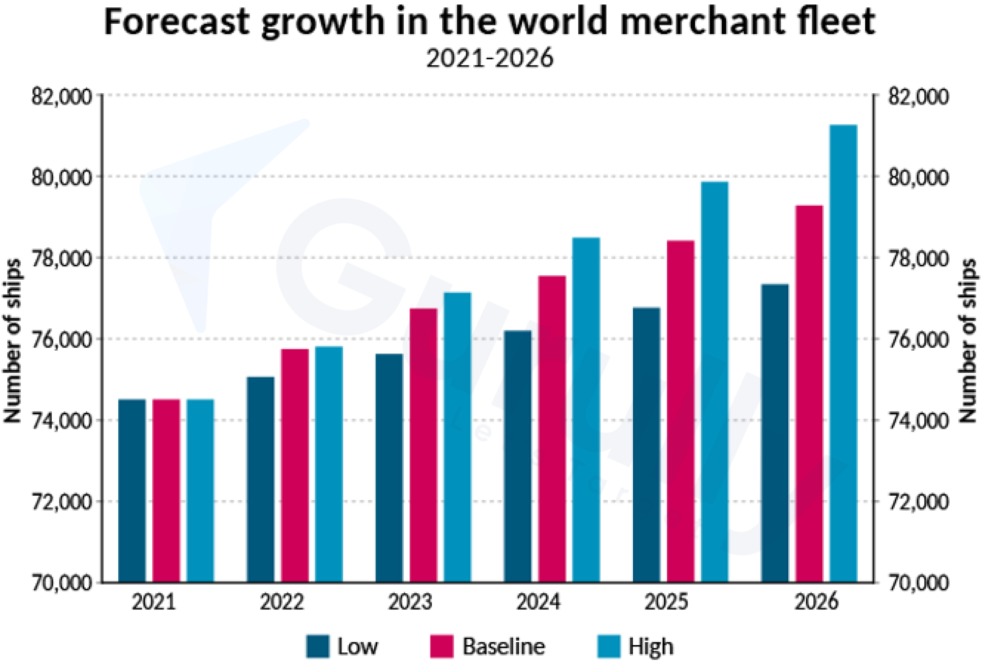
The bar chart forecasts world merchant fleet growth from 2021 to 2026 under low, baseline, and high growth scenarios. Starting at 74,000 ships in 2021, the high growth scenario surpasses the others by 2022, widening the gap through 2023. Growth continues steadily, with the high scenario leading into 2024 and 2025. By 2026, the high growth scenario peaks at 82,000 ships, the baseline is slightly lower, and the low growth scenario reaches 78,000, showing varying growth rates.
Example – 2
Description:
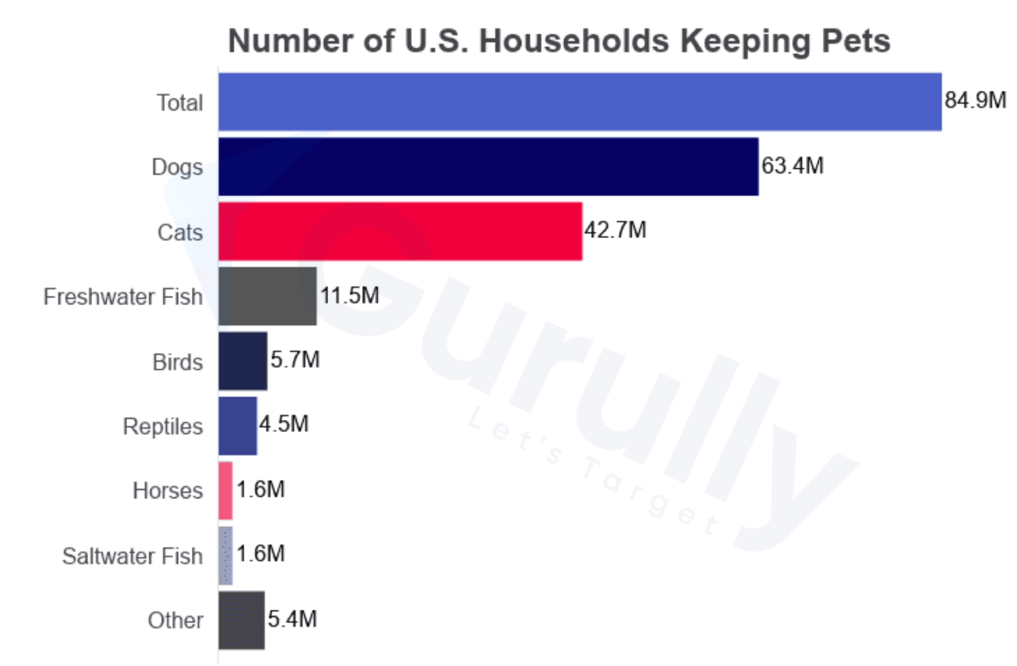
This bar chart shows the number of U.S. households with pets, totaling 84.9 million households. Dogs are the most popular, found in 63.4 million homes, followed by cats in 42.7 million. Freshwater fish rank third with 11.5 million, while birds are kept in 5.7 million homes. Reptiles are in 4.5 million households, slightly ahead of horses and saltwater fish, each at 1.6 million. Lastly, 5.4 million households have pets under “other.” The data highlights the dominance of dogs and cats, with a significant drop for other pets.
Example – 3
Description:
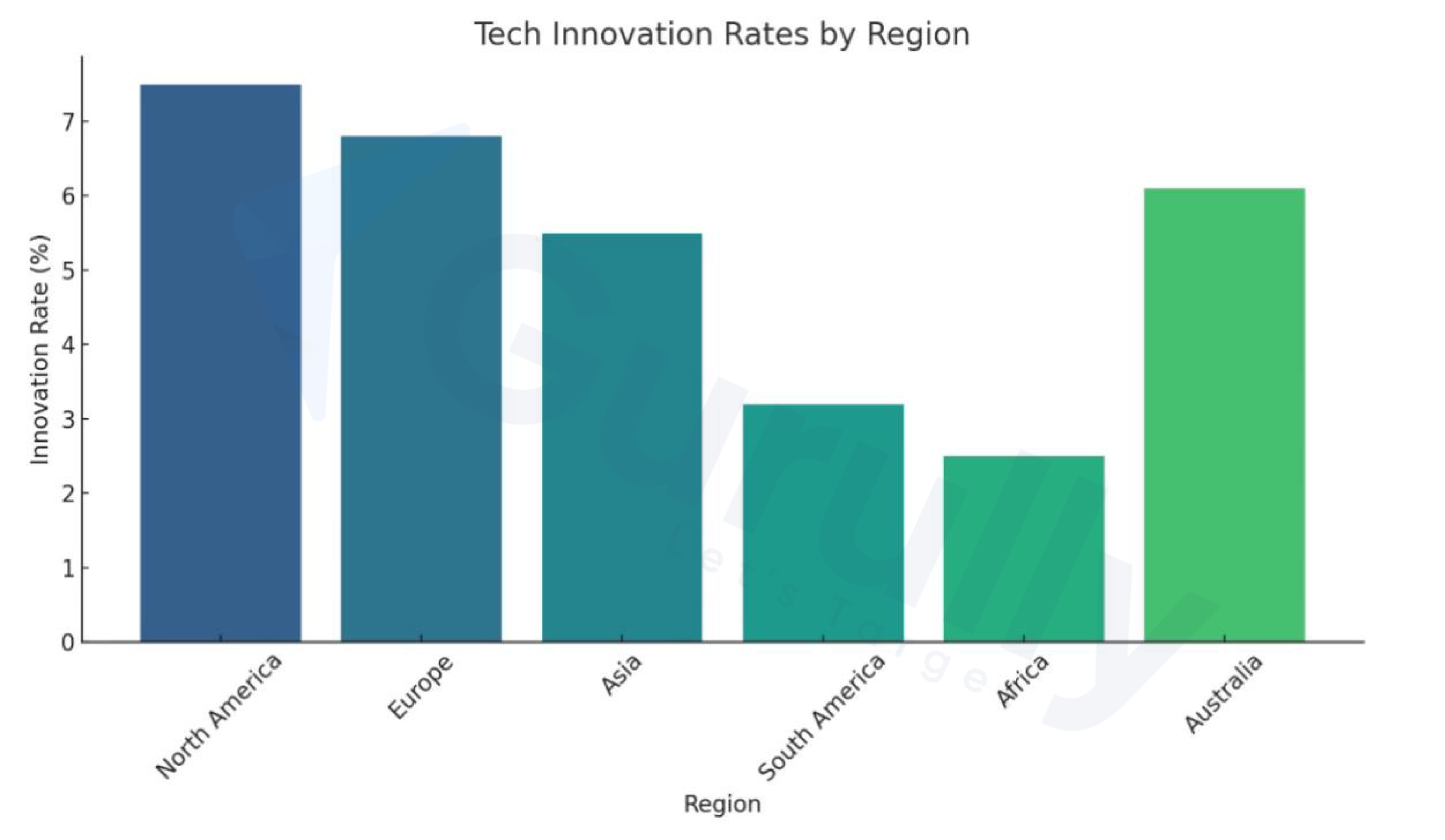
The “Tech Innovation Rates by Region” bar chart highlights innovation percentages across six regions: North America, Europe, Asia, South America, Africa, and Australia. North America leads over 7%, followed by Europe and Asia at slightly above 6%. Australia also performs strongly, matching Europe and Asia. In contrast, Africa has the lowest rate, below 3%, while South America, at 4%, performs marginally better. The chart reveals a divide between developed regions—North America, Europe, and Australia—and developing regions like Africa and South America, emphasizing the role of economic development in fostering innovation..
Example – 4
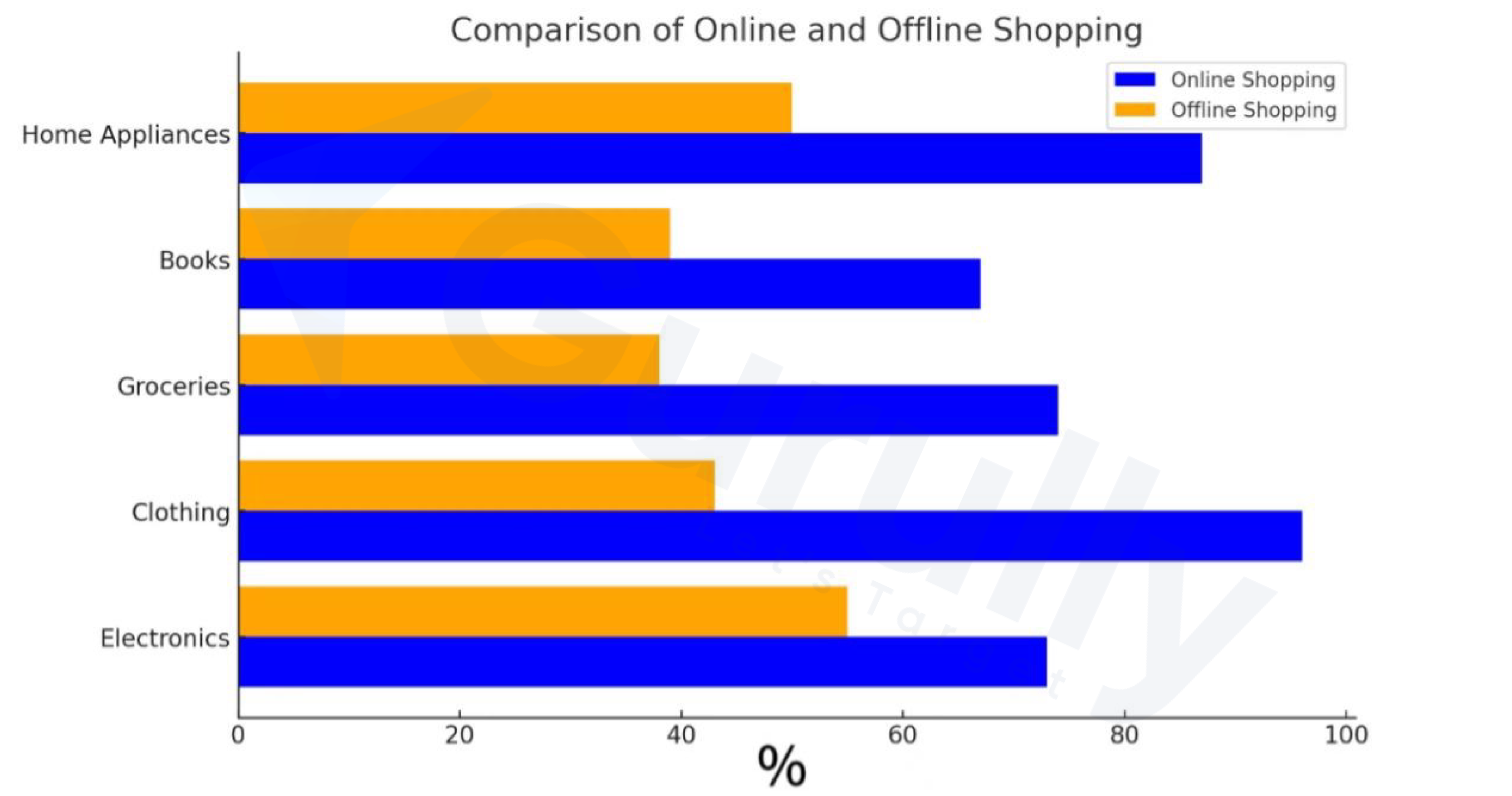
Description:
The horizontal bar chart “Comparison of Online and Offline Shopping” compares preferences across five product categories: Home Appliances, Books, Groceries, Clothing, and Electronics. Electronics lead online shopping, followed by Clothing and Books. Groceries favor offline shopping, but online has a slight edge. Home Appliances show a small online preference. Overall, the chart highlights strong online shopping trends for electronics, clothing, and books, while offline shopping remains significant for Grocery and home appliances.
Example – 5
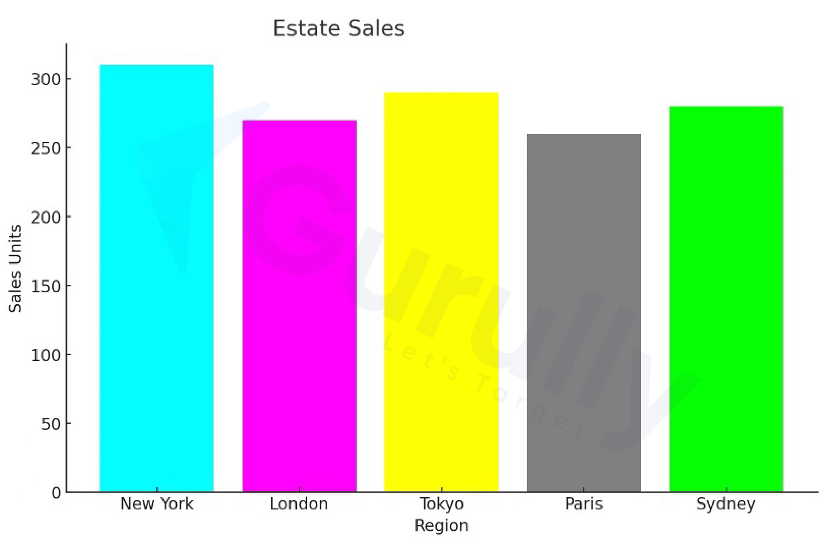
Description:
The “Estate Sales” bar chart compares sales units across five cities: New York, London, Tokyo, Paris, and Sydney. New York leads with over 300 units, followed by Tokyo and Sydney, showing strong performance. London, slightly behind, achieves over 250 units, while Paris ranks lowest with just under 250 units. The chart highlights New York’s dominance, with Tokyo and Sydney performing well, while London and Paris show moderate sales.
Example – 6
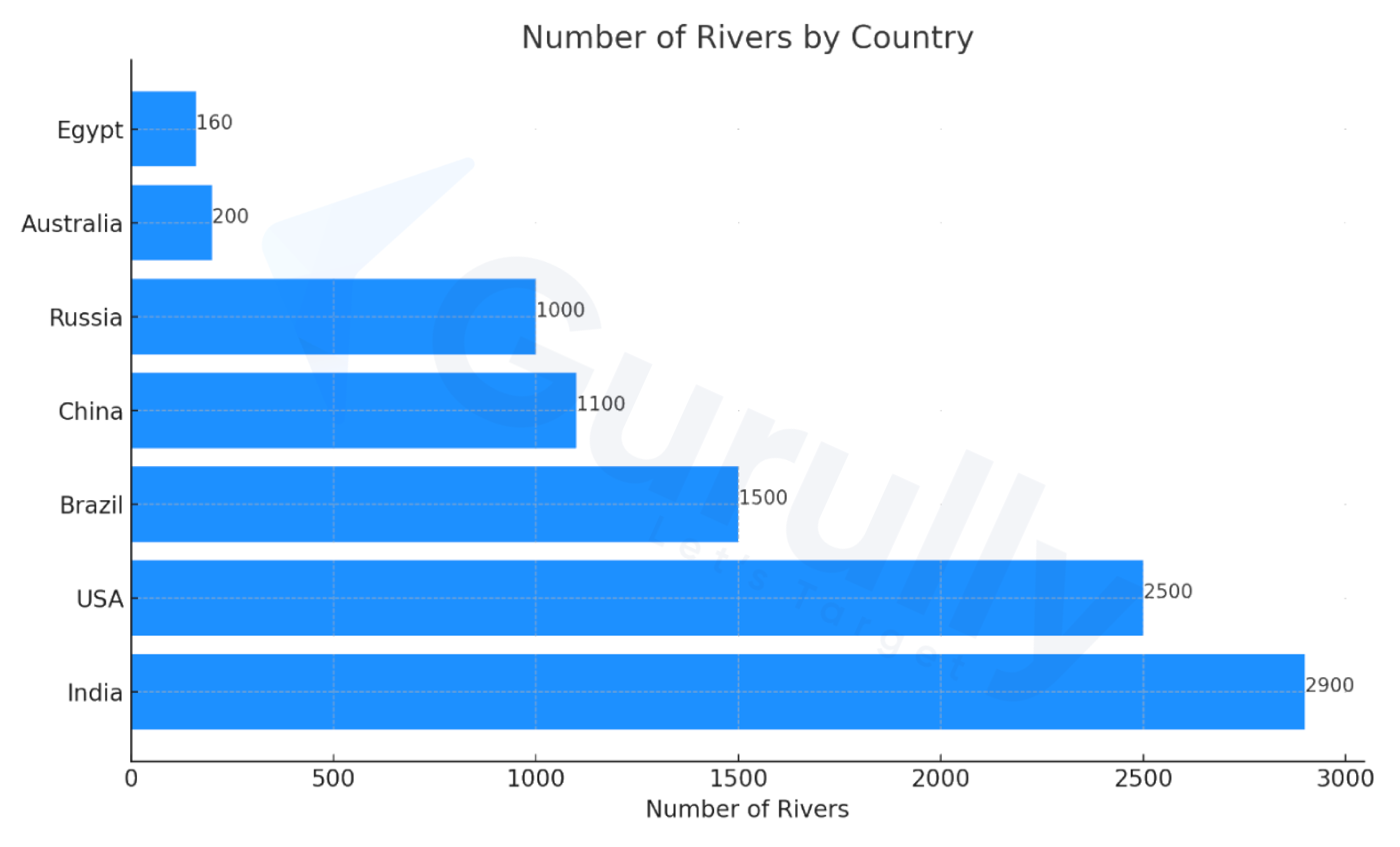
Description:
The bar chart shows the “Number of Rivers by Country” and compares river totals in various countries. India leads with 2,900 rivers, followed by the United States at 2,500. Brazil ranks third with 1,500, while China and Russia have 1,100 and 1,000, respectively. Australia has 200 rivers, and Egypt has the least with 160. The chart highlights the disparities in river distribution, with India and the U.S. having the most, while Egypt has the fewest. The varying bar lengths clearly represent these differences.
Example – 7
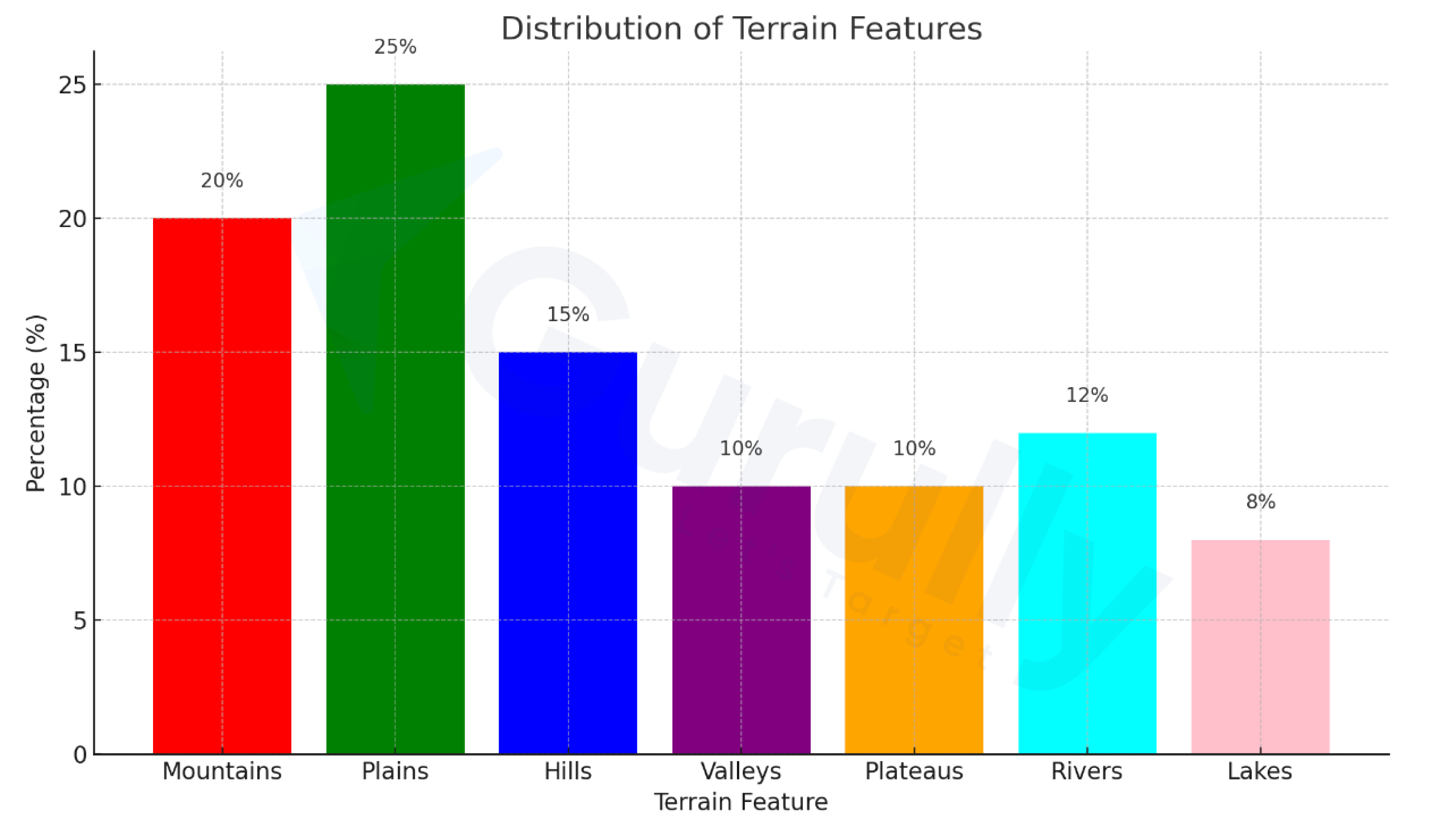
Description:
The bar chart shows the “Distribution of Terrain Features” and their percentage representation: Plains make up 25%, followed by Mountains at 20%. Hills represent 15%, and Rivers account for 12%. Valleys and Plateaus each make up 10%, while Lakes are the least at 8%. Each terrain type is color-coded with labels above the bars for clarity, effectively illustrating the proportional distribution of these features.
Example – 8
Description:
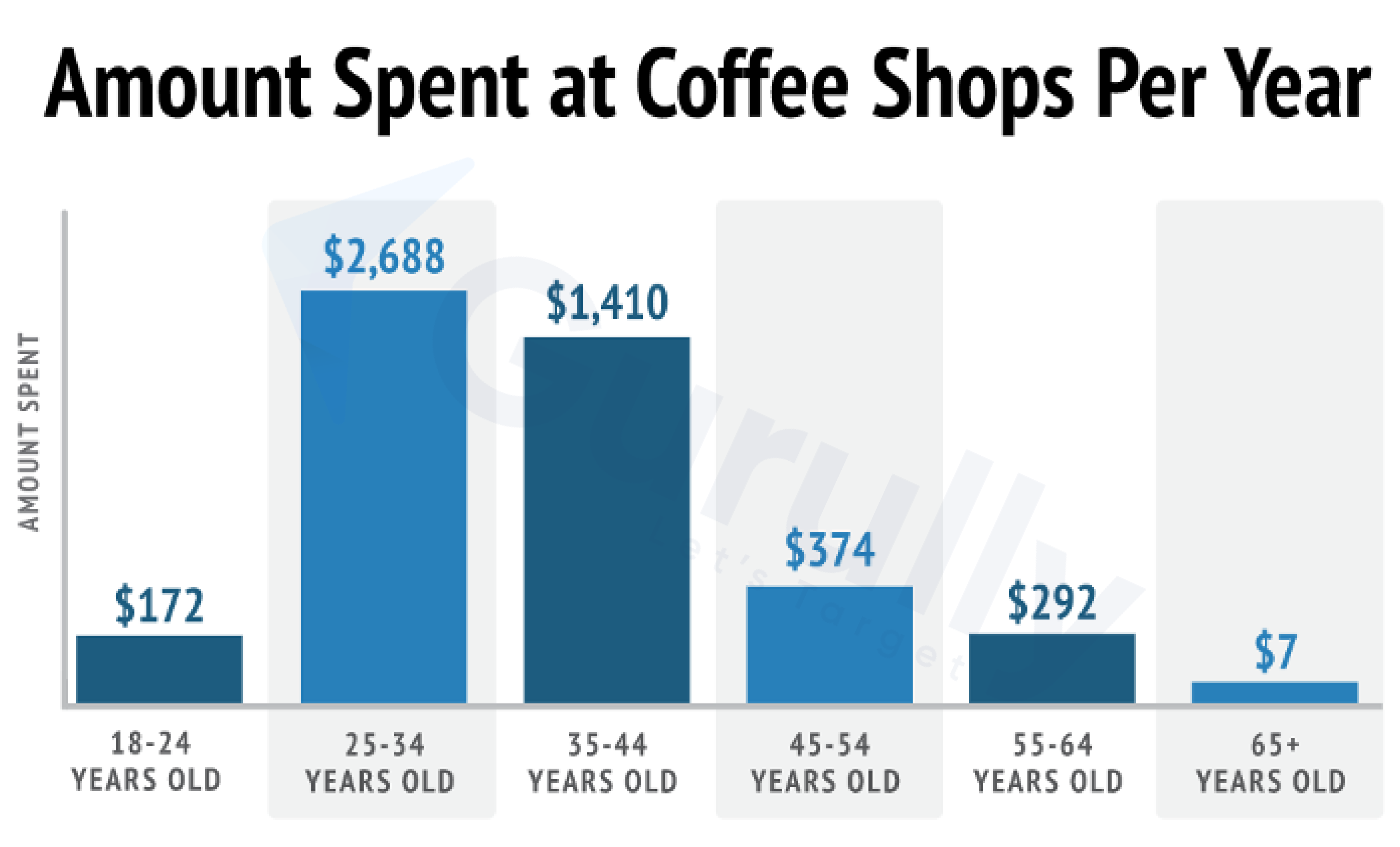
This bar chart illustrates annual coffee shop spending across six age groups. The 18–24 age group starts low at $172, while the 25–34 age group spends the most at $2,688. Spending decreases to $1,410 for the 35–44 age group, followed by a sharp drop to $374 for the 45–54 group. The 55–64 age group spends $292, and the 65+ group has the lowest expenditure at just $7. Overall, the data shows peak spending in the 25–34 group, with a consistent decline across older age groups.
Example – 9
Description:
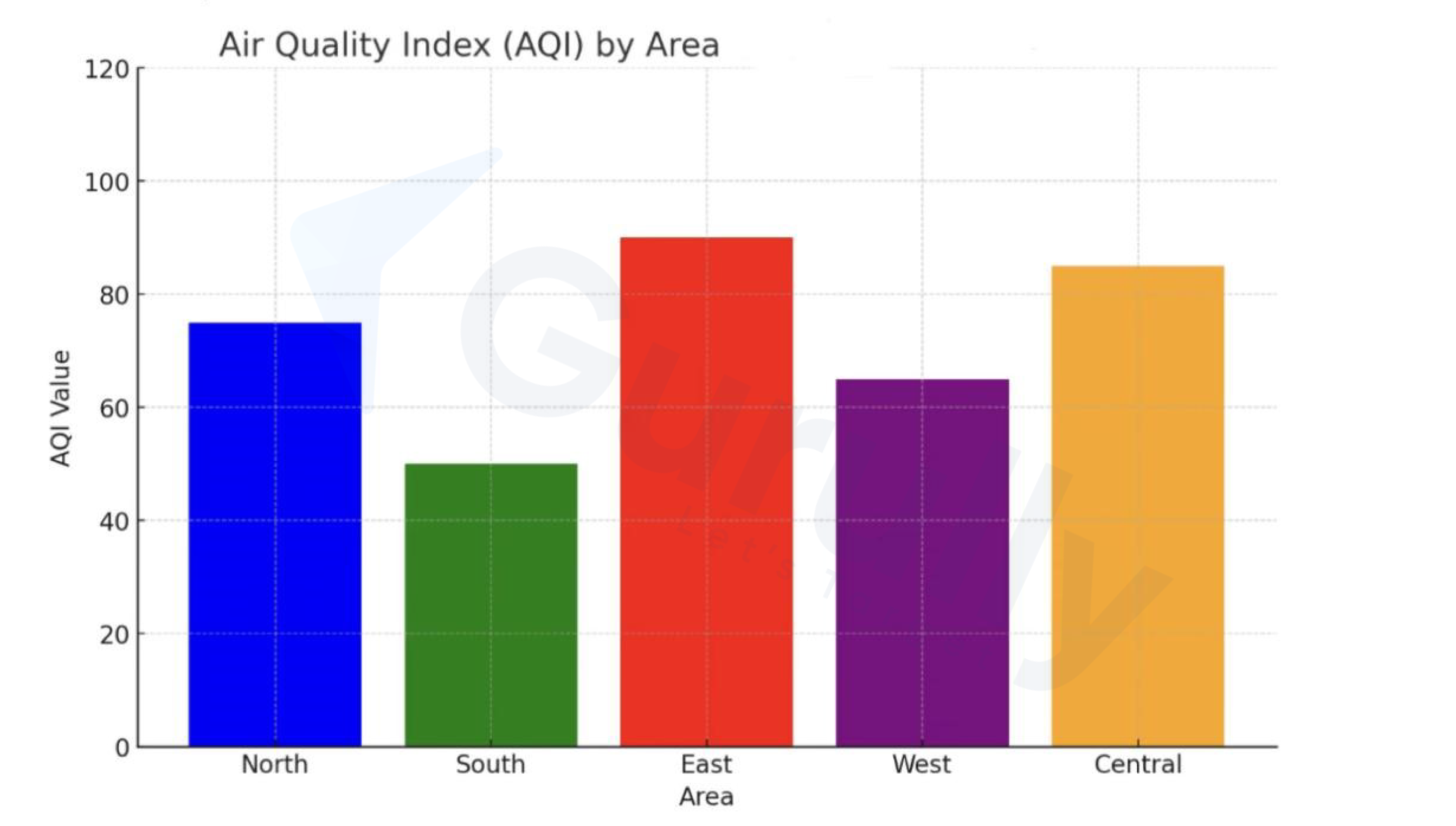
The bar chart shows the Air Quality Index (AQI) across five regions: North, South, East, West, and Central. The East has the highest AQI at around 100, indicating the poorest air quality, followed by the Central region at 80. The North and West have similar levels, around 60, while the South has the lowest AQI at 40, reflecting the best air quality. Overall, the chart highlights significant variations in air quality, with the East being the most polluted.
Example – 10
Description:
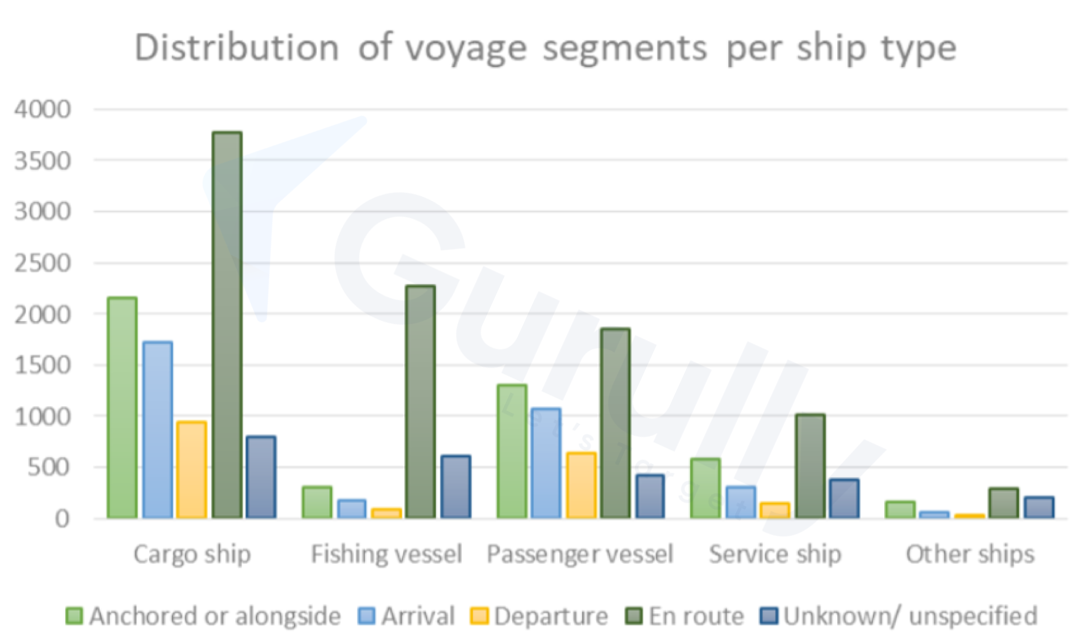
The bar chart shows voyage segments for ship types: cargo ships, fishing vessels, passenger vessels, and service ships. Cargo ships lead the “en route” category with over 3,500 voyages, followed by passenger and service ships. Fishing vessels are mostly “anchored or alongside,” while passenger vessels are split between “arrival” and “departure.” Other ship types show low activity. Overall, “en route” is most common for cargo and passenger ships, while fishing vessels are mainly stationary.
Example – 11

Description:
The bar chart shows the global decline in ship scrapping from 2013 to 2019. The peak was 1,213 ships in 2013, followed by a drop to 1,026 in 2014 and 768 in 2015. A slight recovery to 862 occurred in 2016, but the decline continued, with 835 in 2017, 744 in 2018, and the lowest, 674, in 2019. The chart highlights a steady decrease in ship scrapping during this period.
Practice this question type on Gurully’s online platform, where you can access full-length mock tests and section-wise practice to enhance your skills. For added convenience, try our free PTE practice test. Gurully’s mock tests provide AI-powered scoring with instant results. If you’re preparing at the last minute, take advantage of our flexible day-wise packages.
Conclusion:
Mastering the Bar Graph PTE task requires a structured approach and strategic preparation. You can ensure a strong performance by organizing your response with a clear introduction, body, and conclusion and focusing on key trends, comparisons, and significant changes. Utilize linking words to enhance coherence, prioritize important details, and stay within the time limit. Practice on Gurully’s PTE mock exam to score high.
FAQ:
What are some useful phrases for describing a bar graph in PTE?
How do I structure my answer for a bar graph in PTE?
How is the bar graph scored in PTE?
Should I mention every detail in the bar graph?
How can I improve my performance in bar graph questions?
Also Read:
- PTE Write From Dictation Tips & Tricks to Score Higher
- PTE Reorder Paragraph Tips & Most Repeated Questions With Answer
Free PTE Practice Test


