
Among the various tasks in the PTE Speaking section, “Describe Image” is often considered one of the most challenging. This task presents a range of visual prompts, but out of those PTE map chart is a bit tricky. While it may seem complex at first glance, with the right strategy and practice, you can still achieve a high score in this task. Here is how.
PTE Map Chart Template
Introduction (What the map is about):
- “This map shows information about [topic of the map], including [time period or comparison if given].”
Overview (Main features or areas):
- “There are several key areas shown on the map, such as [mention main places/locations/landmarks].”
- “We can also see [mention any major change or difference – like new buildings, roads, zones, etc.].”
Details (Changes or comparisons):
- “In the [direction or part – north, south, etc.], we can see [describe one change or feature].”
- “Compared to the past, [mention any change if two maps are shown].”
- “Some areas have changed from [old use] to [new use].”
Conclusion (Summary line):
- “Overall, this map highlights the [main change/purpose/plan] and shows how the area has developed or changed over time.”
Tips to Score High In PTE Map Chart
Start with a General Overview
Begin your response by giving a summary of what the map is about. It will help set the context for the topic you will explain. A simple and straightforward introduction lets you get into the flow of speaking and shows you understand the big picture.
Example :
- “The image illustrates changes in the layout of a city over two time periods.”
Focus on Key Features
You will often see data on infrastructure, transportation, land use, or public spaces. You don’t need to describe everything—pick two to three significant features and explain them clearly.
Use Directional and Comparative Language
While describing the PTE map chart, use relevant vocabulary to describe about locations and places. Using this vocabulary will make your response easy to understand and appropriate.
- Directions: north, south, east, west
- Prepositions: next to, in the middle, at the corner, between, along, across
- Descriptive terms: adjacent to, surrounding, near, far from
Compare Effectively (if Two Maps Are Shown)
If you’re shown two maps—usually showing a place in different years- then compare and highlight the differences. Avoid simply listing features. Focus on how things have changed and what’s different or new. Use transition words like:
- “Compared to the previous map…”
- “Over time, the area has changed by…”
- “In contrast to the earlier layout…”
Speak Fluently and Maintain Flow
To score high in PTE map chart description, along with describing relevant information, try to maintain the fluency. Don’t pause too much or try to use overly complex language that slows you down. Instead:
- Speak naturally and clearly
- Use linking words to connect ideas (e.g., “Firstly,” “Moreover,” “As a result”)
- Avoid self-correction unless necessary—it breaks your fluency
Practice Time Management
Always practice under timed conditions. You only have 40 seconds to speak so respond in a structured way. Practicing this rhythm will help you stay within the time limit while covering all necessary points.
- 5 seconds: Introduction
- 20–25 seconds: Key features or comparisons
- 5–10 seconds: Conclusion or summary
End with a Short Conclusion
Wrap up your response with a summary that shows you’ve understood the image as a whole. Even one sentence can help bring closure to your response.
Example:
- “Overall, the map highlights significant urban development and improved infrastructure over time.”
PTE Map Chart Sample Questions With Answers
Example 1
Description:
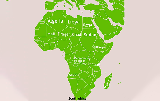
The image displays a geographic map of Africa, highlighting the countries within the continent. Some of the prominent nations shown include South Africa, Egypt, Nigeria, Sudan, and Libya. The map clearly represents Africa’s political divisions, showcasing its significant countries and their relative locations.
Example 2
Description:
The image displays a world map with countries highlighted in varying shades of blue, possibly indicating different geographical or political distinctions. The map provides a comprehensive view of the Earth’s continents and oceans, serving as a helpful tool for discussing global topics such as climate change, international trade, or cultural diversity.
Example 3
Description:
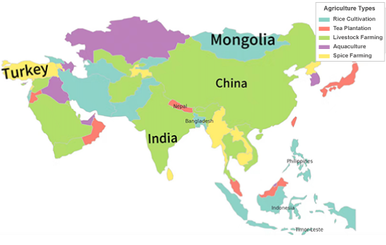
The map highlights various Asian agricultural types, including rice cultivation, tea plantations, livestock farming, aquaculture, and spice farming. China and India focus on rice cultivation, while tea plantations dominate Nepal and northern India. Mongolia emphasizes livestock farming due to its grasslands. Aquaculture thrives in coastal regions like Indonesia and the Philippines. Spice farming is common in parts of South Asia, especially India and Sri Lanka. This distribution reflects the impact of geography and climate on agriculture.
Example 4
Description:
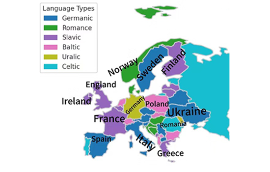
The map shows the distribution of prominent European language families: Germanic, Romance, Slavic, Baltic, Uralic, and Celtic. Germanic languages like English and German dominate Western and Northern Europe. Romance languages—French, Spanish, and Italian—are common in the South. Slavic languages, including Russian and Polish, are spoken in the East. Baltic languages are found in Latvia and Lithuania. Uralic languages appear in Finland and Estonia, while Celtic languages survive in Ireland and Scotland. This reflects Europe’s historical and cultural evolution..
Example 5
Description:
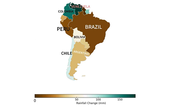
The map represents rainfall variations across South America, with different shades indicating levels of precipitation change. Brazil, Argentina, and Chile show lower rainfall levels, represented by darker brown shades, whereas Venezuela and Colombia receive significantly higher rainfall, indicated by green tones. The gradient highlights regional climatic differences, with northern regions being wetter and southern areas experiencing drier conditions. This pattern suggests climate change effects, geographical factors, and variations in seasonal weather patterns across the continent.
Example 6
Description:
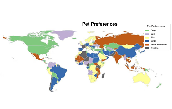
The map illustrates global pet preferences by region, categorizing them into dogs, cats, fish, birds, small mammals, and reptiles. Dogs are the most popular pets in North and South America, while cats dominate in parts of Europe and Asia. Fish and birds are common in some coastal and tropical regions, while small mammals and reptiles have a smaller presence in specific areas. The distribution reflects cultural differences, lifestyle preferences, and environmental factors influencing pet ownership worldwide.
Example 7
Description:
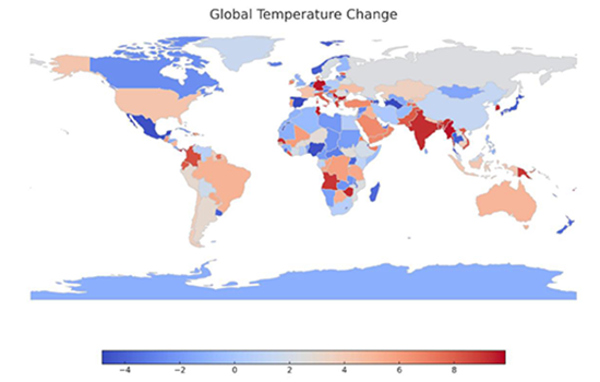
The map displays global temperature changes, with different shades indicating variations across countries. Regions in red show an increase in temperature, particularly in parts of Africa, Asia, and South America. Blue areas represent a decrease, mainly in the Arctic and some parts of Europe. The data suggests climate change effects, with warming trends more dominant globally. This pattern indicates rising concerns about global warming and shifting climate patterns across different continents.
Example 8
Description:
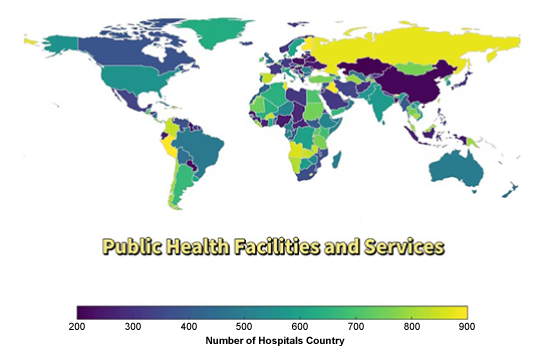
The map illustrates the distribution of public health facilities worldwide, represented by the number of hospitals in each country. Lighter shades indicate more hospitals, while darker shades represent fewer healthcare facilities. Countries in North America, Europe, and parts of Asia have more hospitals, whereas some regions in Africa and South America have fewer. This suggests global disparities in healthcare infrastructure, with developed countries having better access to medical services than developing nations.
Example 9
Description:
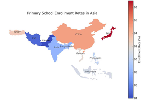
The map illustrates primary school enrollment rates across Asian countries, with color variations indicating different percentages. Japan and China have the highest enrollment rates, exceeding 96%, while Pakistan and Iran have lower rates, around 84-88%—countries like India, Bangladesh, and Vietnam fall within the mid-range. The data suggests strong educational access in developed nations, while some regions may face barriers to universal primary education.
Example 10
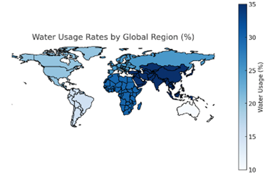
Description:
The map illustrates water usage rates across different global regions, with darker shades indicating higher consumption and lighter shades representing lower usage. Asia and parts of Africa show the highest water consumption, exceeding 30%, while North America and Europe fall in the mid-range. Some regions, particularly in South America and Australia, have the lowest water usage levels, below 15%. The data highlights regional disparities in water consumption, likely influenced by population density, agriculture, and industrial demands.
Example 11
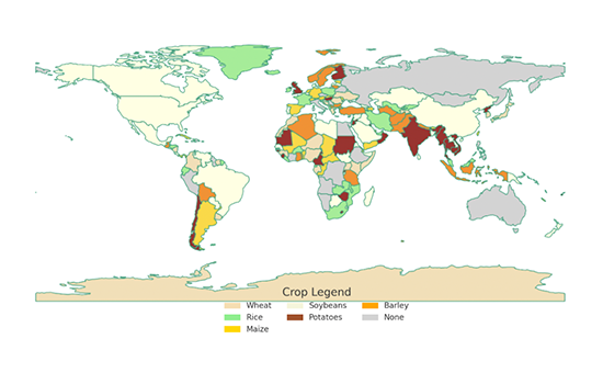
Description:
The map shows the global distribution of major crops like wheat, rice, maize, soybeans, potatoes, and barley. Wheat is mainly grown in North America, Europe, and parts of Asia. Rice dominates in South and East Asia, especially India and China. Maize is common in the Americas and parts of Africa. Potatoes are grown in Europe and Asia, while soybeans and barley appear in scattered regions. Some areas have no dominant crop, reflecting different agricultural focuses. The map highlights how climate and geography influence crop patterns worldwide.
You can practice more of these questions on Gurully, which offers full-length mock tests and over 30,000 practice questions. Our platform provides a real exam-like simulation, allowing you to practice under timed conditions. With AI-powered scoring, you’ll receive accurate performance evaluations to help you track your progress and target scores. You can also focus on individual section tests to strengthen specific preparation areas.
Conclusion:
The PTE Describe Image Map Chart task can be challenging, but it’s easy to improve with the right strategy and regular practice. Focus on key features, use clear comparative language, and maintain fluency to structure a strong response. For more practice, visit Gurully—where you’ll find 30,000+ questions, full-length mock tests, and AI-powered scoring to help you track your progress and hit your target score.
Also Read:
- PTE Describe Image Template 2025 – Practice with 50 Examples
- Bar Graph PTE Describe Image – Tips, Templates & Examples to Score High
- Learn 59+ Dictation Words For PTE Exam To Score High