

PTE Describe Image Practice
Develop your analytical and verbal skills with Describe Image Practice, helping you explain visual information clearly.
![]() PTE
PTE
![]() IELTS
IELTS
![]() DUOLINGO
DUOLINGO
![]() CELPIP
CELPIP
Develop your analytical and verbal skills with Describe Image Practice, helping you explain visual information clearly.
Look at the given Image below in 25 seconds, please speak into the microphone and describe the details what the Image is showing. You will have 40 seconds to give your response.

00:00
00:40
00:00
Speaker Type: N/A
Sample Answer :
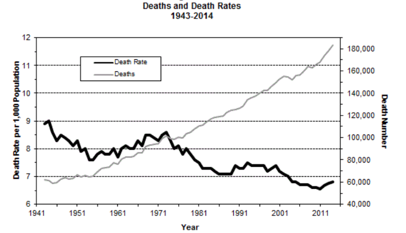
The given line graph represents the death and death rates between the year 1943 to 2014. As per the image in the year 1941, the death rates and death were around 120000 and 7 per 1000 population. Over the period, the deaths of people rose continuously and finished at 12 death per 1000 people. On the other hand, the death rate decreased over the period and reached 60000 in the year 2011. Overall, the deaths increased over the period in comparison to the Death rate.
Sample Answer :
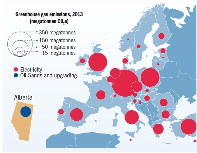
The given image represents the greenhouse gas emission in 2013 by electricity and oil sands and upgrading. As per the image, the highest emission of the greenhouse was electricity, which is in the middle of the map. On the other hand, for the oil and sands upgrading, the maximum was in Alberta. Overall, the major contributor to the greenhouse in 2013 was electricity.
Sample Answer :
The given bar graph represents the nationalities of NHS England staff as a percent of the workforce for the UK, EU & EEA, and the Rest of the world. As per the image, the maximum for the UK was for the category All staff having 82%. While on the other hand, the lowest was for EU & EEA as for All staff having just 4%. Overall, the UK was having the maximum workforce for all nationalities.
Sample Answer :
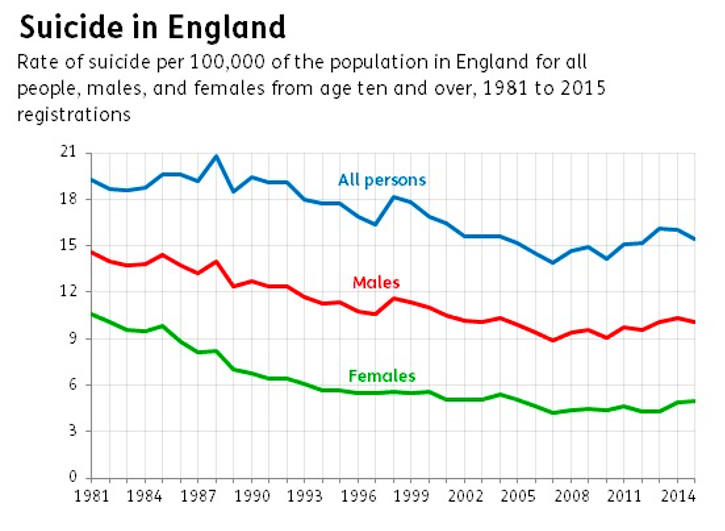
The given line graph represents the suicide in England per 100000 between 1981 to 2015. As per the image in 1981 the suicide rate for All person, Males and Females were 20, 15, and 11 respectively. Over the period, the number started declining for all the three categories and reached 18, 13, and 5 respectively at end of 2014. Overall, the suicide rate decreased in England.
Sample Answer :
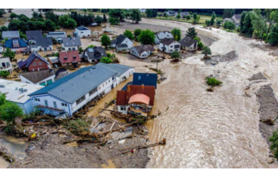
This image represents the flood that occurred during the rainy season in a village. It can be clearly seen that water is rushing through the houses and taking everything with it. It is also visible from the image that everyone has evacuated from the village. Overall, we can see that there is a very worst situation in the village, and water is seen everywhere.
In this task, an image will appear on the screen, and you have to describe that image in 40 seconds. Before the recording starts, you will have 25 seconds. The time to answer for PTE academic describe image & PTE Core describe image is same.
Prompt Length |
Skills Assessed |
No. Questions |
Traits Scored |
|---|---|---|---|
|
Not- applicable |
Speaking |
3-4 |
Content, Oral Fluency & Pronunciation |
Spend the initial 3-4 seconds analyzing the image. Identify the type (e.g., bar chart, line graph, map, diagram, or picture) and grasp the key elements. Focus on trends, highest and lowest values, and notable features.
Speak naturally without pauses or hesitation. Avoid fillers like “um” or “uh.” Pronounce words clearly and correctly. Practice with diverse images to improve confidence.
The preparation time is limited, so think fast. Practice summarizing images within 25-30 seconds. Your response should be 35-40 seconds long.
Simulate exam conditions to build confidence. Use Gurully.com to access free PTE describe image practice and various image types, and analyze your performance. You can also take advantage of the PTE practice test on Gurully.